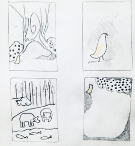
A storyboard is used to organise the text across the number of available pages of the book, to iron out any problems. Illustrations are usually sketched on the ‘pages’ of the storyboard, so the author, illustrator, editor and designer can each see the author’s concept of the book. Storyboarding helps the author to nut out any issues, and detect any dead spots or sequence dilemmas.
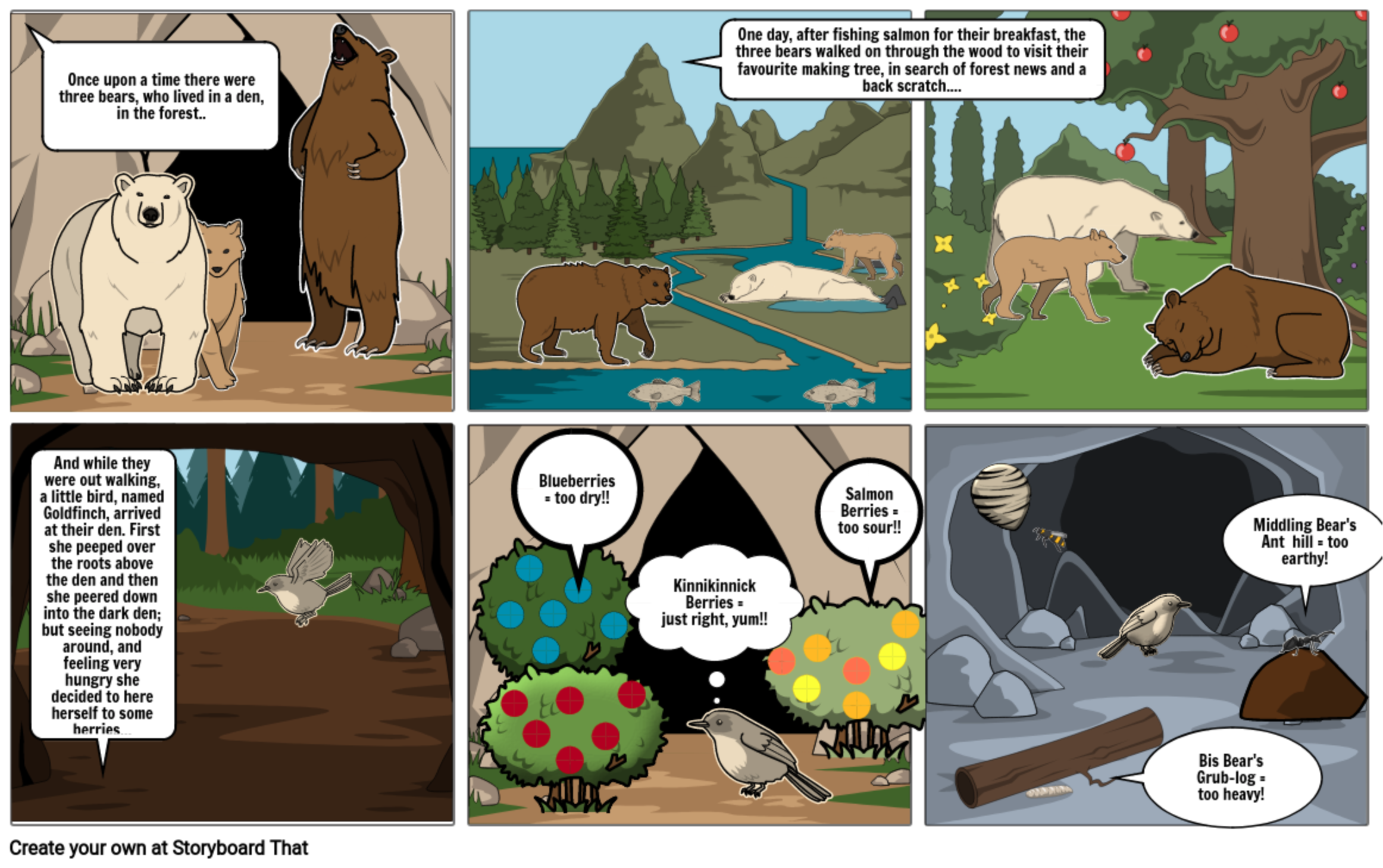
With this in mind, I have begun storyboarding for my bigger piece and tech project, first using paper & pencil (image directly below) and then experimenting with the online program Storyboard That –to test out my ideas, and the process of using an online/digital format.

J. Riddell Matte (2021) Storyboard WIP

J. Riddell Matte (2021) Storyboard WIP #2
My thoughts….
I think that the ‘Storyboard That’ product looks very professional. The interface was intuitive and I loved that there was a wide variety of images to choose from. I appreciated that it offered different positions for the animals to be in, that you could shift the direction of images and mess around with the colours. I enjoyed adding text, the options provided for the text bubbles were fun and I liked the creative process of considering the story to allow for the images to carry some of its detail.
I also found the process to be a bit tedious. It was often tricky to maneuver the images, to the point where the whole background would shift when I tried to select and edit smaller components. As you can see above, despite having saved my work many (many!) times, there is missing/dropped text from the final image, which is frustrating. I am unsure as to how user friendly this platform would be for students, but that being said, this is my first time trying it and I am using the free format. I think that this would be a great platform for classroom use on smaller projects, as it allows for creativity without the risk of having your artwork judged, as well as story-telling or information sharing, but would require a larger chunk of time be made available for students to really play and enjoy the process.

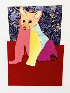
J Riddell Matte (2012) Cut-out Bear
One of the suggestions that has come up multiple times throughout my inquiry, is that successful illustration requires a personal creative style. This style may vary from project to project, but should be consistent over the course of an individual story.
In an effort to work on my style, I have been playing with various art techniques, materials and attempting to push myself outside of my comfort zone. I recently started a new course on Domestika – Story Illustration with Paper by Estrellita Caracol, which has been wonderful so far and the image of the bear, to the left, is a product of this course.
This week I will continue working on my storyboard layout, creating images and experimenting with the ComicLife program. I have also taken out a number of graphic novels from the local library, to look at how they have been designed re: the layouts, colors and story.
Graphic Novels
Sugar Falls; A Residential School Story by David Alexander Robertson & Scott B. Henderson
Drowned City; Hurricane Katrina & New Orleans by Don Brown
Lucy Dreaming by Max Bemis & Michael Dialynas
Be Prepared by Vera Brosgol
Additional Resources
Core Ipad Apps for SD61 – is a great resources to check-out the apps that are regularly in use/available on SD61 tablets.
ComicLife is the graphic novel program used by SD61 ( I am excited to try it next!)
A Brief History of Children’s Picture Books and the Art of Visual Storytelling by Maria Popova @ brain pickings.com
Claire Lordon Design: Made with A Smile has loads of interesting information and suggestions around planning, writing and illustrating children’s books.
Christine Sharp: 12-part Guide to Writing and Publishing Children’s Books
I love your work, Jen!!