“Porridge, Porridge” by The Brothers Grimm, illustrated & read by J. Riddell Matte, 2021
Category: EDCI 336 (Page 2 of 2)
This is a category for the EdTech course. Please add this category in addition to the relevant edtech assignment category(ies).
Concept Attainment…
…can be thought of as game of ‘find the rule.’ Concept Attainment is a ‘backward conceptualizing’ approach to making sense of new ideas. It is a teaching strategy characterized (in terms of thinking patterns of the learner) by “a pattern of decisions in the acquisition, retention, and utilization of information that serves to meet certain objectives” (Bruner et al 1956). [Teach Thought]
I love this approach to teaching & learning!
Jennifer Gonzalez, author of the ‘Cult of Pedagogy‘ blog, describes Silver, Strong, and Perini’s (2007) research behind concept attainment as a successful strategy, which fosters both student engagement and a greater understanding of the learning material, because as humans we are naturally inclined to organize our experiences around observed similarities.
While watching the above video (and looking through other examples) I found myself wondering what it would feel like to participate in concept attainment as a class member, looking at ‘yes’ and ‘no’ examples and discussing the differences and similarities while trying to define the focus concept. I also thought about how, as a teacher, you would go about successfully creating a concept attainment lesson, the examples that you would choose and how you might engage students in a constructive interaction while not giving the answers away…so interesting!!!
“Learning how to learn is Life’s most important skill” – Tony Buzan
Resources::
Alberta Ministry Of learning. Concept Attainment
Focus on Inquiry: A teacher’s Guide to Inquiry-based Learning, Alberta Ministry Of Learning, 2004.
Silver, Strong & Perini. (2007) The Strategic Teacher: Selecting the Right Research-Based Strategy for Every Lesson.
Wonderopolis – is a great resource for starting an inquiry//asking Big questions!!
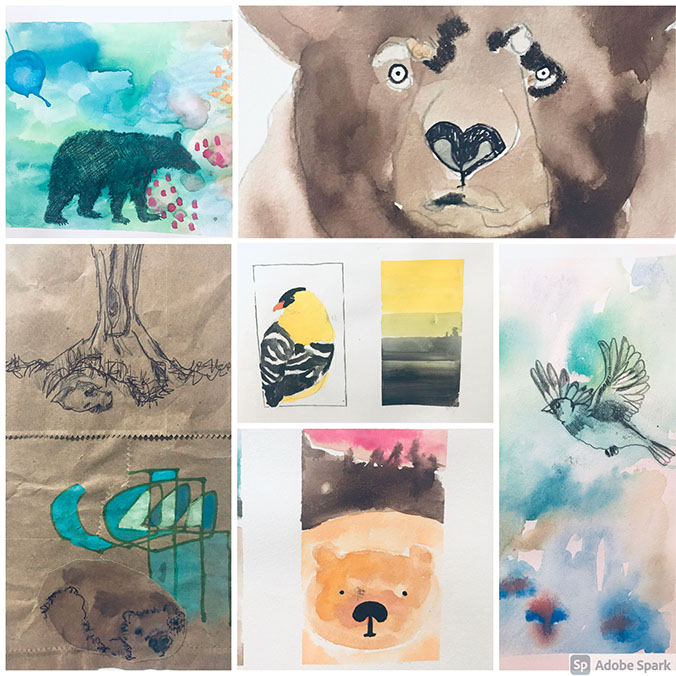
J.Riddell Matte. Goldfinch & The Three Bears (2021)
Truth?
This project still feels a bit like a free-fall, even with Mr. Scheffler’s trio of tips, which have been extremely helpful in keeping me on track, I am often overwhelmed about where to even begin with interpreting a children’s story.
In an effort to find more guidance (+ a smidge of calm), I decided to take Adolfo Serra’s course on Domestika, “Introduction to Children’s Illustrations”. I am almost done, and it has been amazing!! In his course Serra breaks down the process of story illustration. He provides tips and homework that encourage both creative thought around your chosen story, as well as experimentation with different mediums, and the art he makes as demonstration is fantastic!
Doing art for this project is happiness for me right now, which is not something I am taking for granted.
So far, I have discovered that I like having the framework of a familiar story. I like considering which are the most interesting bits and how they should be illustrated. I like thinking about whether to layer images on a page, or not. I like reminiscing about the books that I loved reading to my boys when they were little, and I adore thinking about & making art.
This week, I am starting to illustrate Goldilocks & The Three Bears. I am not sure how successful I will be but…I am also not sure that matters so much anymore.
Additional Resources
Note: In order to share my art for this post, I wanted to find a collaging program/app that would allow me to combine my paintings into to one image. I looked into a number of programs & settled on the Adobe Spark. It’s a free, online program that allows you to add your photos and provides a number of options for design – it was fun & very easy to use.
“Don’t settle for the world from just your angle, remember that we’re all part of one giant dream tangle” – Brad Montague
In learning more about the Web Accessibility Guidelines (WAG) this week, I expanded my understanding of accessibility, as it relates to the internet and broadened my perspective on Universal Design for Learning (UDL). In my opinion, this is an important concept for pre-service teachers to consider if we hope to effectively support and engage each of our students.
One of the few social media platforms that I engage with is Instagram. In a previous version of this life I was a stay-at-home-homeschooling mama, with jewellery making as a side hustle. Instagram was a way for me to connect with the local art community, as well as promote the markets and the shops that were kind enough to host my work.
Over the past couple of years there has been noticeable movement towards making this platform more inclusive. Instagram shares that they have created an “automatic alternative text”, as well as “custom alternative text” with each providing an expanded capability and a variety of new text fonts that allow users to include descriptions of the images they post, which enables those using screen readers to engage with the individual post, and to a greater degree with the platform. If you are curious to learn more about screen readers, the website NOMENSA has a great overview.
In trying to gain a better understanding about what the WAG means in terms of students and teaching, I found this video on “Website Accessibility” to be extremely helpful…
In the video Ran Segall discusses;
- Color, Contrast & Text size
- Apps that can assist with implementing WAG guidelines for example the MDS Contrast -which supports designers in ensuring their website’s color + contrast is accessible
- Design Focus States – for people who use a keyboards + tab to engage with the web
- Form Labels – asks that you include the labels above for the form field vs. within the form field
- Alt tabs for images – ensuring that designers place a description explaining what an image is that can be read by a screen reader
This article, ‘Font Legibility for Students who are Blind or Visually impaired‘ by Carmen Willings, is aimed primarily at the accessibility of paper resources, but discusses many of the same requirements that Ran Segall unpacks in the above video and goes into greater detail around what, for example, text accessibility involves.
In the article Willings shares that the most legible fonts are; Arial, Verdana, Tahoma and Sans Serif, that contrast is more effective at setting text apart than color and that size is better at creating differentiations in text when compared with the use of italics, all caps, no caps or the other more flourishy fonts, which can all be challenging for the visually impaired to navigate.
Some of the above were quick fixes, like experimenting with color contrast for my links but others, such as differentiating fonts, sizes and underlining text, were trickier and required that I wade into the world of HTML coding.
After a little research, and as a basic place to start, I have compiled some simple HTML codes from W3Schools that I found helpful in customizing text font, size and color.
Font:: <p style=”font-family:font name here “> your paragraph.</p>
Text Size:: <p style=”font-size:size#px“> your paragraph.</p>
Text Color:: <p style=”Color: color “>your paragraph.</p>
Note: Although it uses “your paragraph” to highlight the text you want to adjust, from what I understand they can be used to highlight a full document, certain paragraphs or single words,
This is obviously not an extensive list, but for me it offers a solid and practical place to start. I experimented with coding, in an effort to customize the text of this entry, but ended up with my text jumbled on a black background – so frustrating!!
I will continue looking into this because I am committed to figuring out how to code, at the very least, for the three aspects listed above, I am really unimpressed that the standard “block quote” format gives such little contrast between the grey background and the slightly darker grey text (!?) and I am still confused about how to underline. (tips are welcome!)
I really enjoyed this week’s material and am inspired to learn more about accessibility as a foundation for applying UDL across my practice.
“Like birds in a murmuration creating figures in the sky, maybe one day we’ll understand, we all help each other fly”. – Brad Montague
Additional Resources
Apple Accessibility – the Apple page that links various apps designed to address accessibility for vision, mobility and hearing differences
Carnegie Museums: Web Accessibility Guidelines v1.0 – provides a ‘Best practices’ for text, and two graphics that illustrate contrasting color (in code) on various backgrounds.
Tip #2: Find Inspiration…
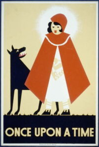
Design by Kenneth Whitely for Works Programme Administration in 1939 – Source.
Tip #1: Find a Story aka The part where I learn about Public Domain.
According to Wikipedia [2021]
“The public domain consists of all the creative work to which no exclusive intellectual property rights apply. Those rights may have expired (this occurs 70 years after the death of the author, or in the United States any book published before 1926), been forfeited, expressly waived, or may be inapplicable.”
Therefore, public domain includes the written works of Jane Austin, Lewis Carrol, Bram Stoker, Sir Arthur Conan Doyle and the Brother’s Grimm, just to name a few.
I am most excited about the fairytales included under this umbrella, both for their charm & wisdom (I wholeheartedly agree with Mr. Einstein) but also their nostalgic familiarity.
I am hoping that my memories, along with having read the story to my own children, will help in my attempt to illustrate Goldilocks and The Three Bears and to possibly re-imagine this classic fairytale, but don’t hold me to this….
Resources::
Grimm’s Fairy Tales, is a large collection of the Grimm Brother’s stories, hosted by the Carnegie Mellon University’s School of Computer Science
The Public Domain Review is a beautiful collection of art & literature that can now found within the public domain
“We have to go from what is essentially an industrial model of education, a manufacturing model, which is based on linearity and conformity and batching people. We have to move to a model that is based more on principles of agriculture. We have to recognize that human flourishing is not a mechanical process–it’s an organic process. And you cannot predict the outcome of human development. All you can do, like a farmer, is create the conditions under which they will begin to flourish.” – Sir Ken Robinson [source]
I love this quote. I love the possibility it presents. I love the idea of simply being a farmer, cultivating the environment and in doing so supporting young people. I love that Sir Robinson sees young people as Whole, not incomplete, not to be controlled or changed, but rather organic beings on their own journeys and if we are lucky enough to play a small part in that, we should do our best to do our best. I love that it leaves room for all of us to grow and change.
The level of engagement, self-awareness and personal growth which the students of High Tech High demonstrated, reminded me of the young people at A.S Neill’s Summerhill School (1960’s). Both schools embrace a student centred model, where their young people are encouraged to engage deeply with the learning material, as well as to reflect on their personal development and goals. Although, I value the level freedom and choice that Summerhill students were given around their learning, I greatly appreciated the example that High Tech High offered in providing both a traditional learning opportunities mixed with the flexibility of incredible learner-led project based challenges.
Additional Resources
Summerhill, a short documentary by Dennis Millar, presented by the National Film Board of Canada, 1966.
Neustatter, Angela. (2011) Summerhill School and the do-as-yer-like kids. The Guardian.
High Tech High Student Projects – a collection of student projects, organized by grade and subject
The first thing I did upon deciding that Learning How to Illustrate Picture Books would be my inquiry topic was, obviously, enter “children’s book illustration” into a YouTube search.
It’s not a very glamorous start but, I am very excited about this project and with a million ideas swirling around in my head, I really needed to find a focus, a voice of reason and guidance, to get the ball (point pen) rolling…..
Enter Axel Scheffler.
Mr. Scheffler is the brilliant, award-winning artist responsible for illustrating such books as The Gruffalo, The Snail and the Whale and Room on the Broom – all written by the talented playwright, song-writer and author Julia Donaldson.
In the short video posted below, Mr. Scheffler shares his “Top 3 tips for budding illustrators” and this is where my journey will begin….
This is where Assignment 3: Educational Technology Guided Resource Development will be presented when complete.